

Jessica Lang Design
Project: Packaging
Student Project: Portfolio Development
Disciplines: Illustrator, InDesign, Photoshop
Description: L’Artiste Chocolate is an artisanal chocolate brand inspired by my mother, who has a profound love of excellent chocolate and a distinct talent for creating beautiful botanical art.
The watercolor paintings used to create the L’Artiste packaging were all hand painted by my exceptionally talented mom, Carol Stanley. She graciously allowed me to borrow her beautiful artwork to create this elegant, artisanal chocolate brand. The name, “l’artiste” – French for “the artist” – is a reference to my mom, who is true artist in many forms – painter, seamstress, chef, among others.
For the logotype, I sought a typeface that would complement, and not distract from, the artwork. I selected a delicate, condensed sans serif font for the brand name and an italic serif font for the for the chocolate and flavor details, all in lowercase. The bounding box and diagonal line are both done in light stoke and meant to add an element of structure while allowing the artwork be the focus.
In order to create a ready for market package, I researched and applied FDA regulations on food packaging. This includes the net weight on the front of the package, nutrition and ingredient information on the back along with minimum type size and placement of these elements.
To expand on the brand, I envision a branded shop with an understated sign out front and sophisticated chocolate related artwork. I designed a piece of wall décor for the shop - a poster diagramming the cacao bean. The diagram labels the various elements of the cacao bean in a classic, retro style.
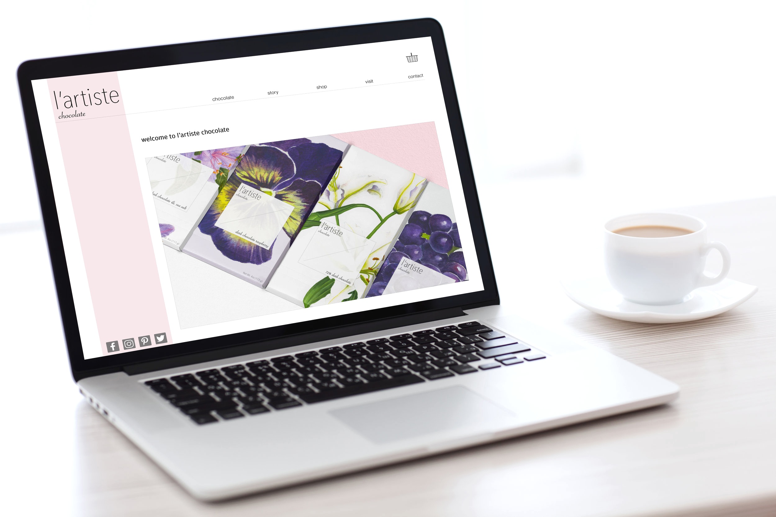
Additionally, I designed a brand website that includes the L’Artiste story, an online shop and information on the brick and mortar shop.
Credit: watercolor paintings by Carol Stanley